Every preset has an interactive chart of its testing on its page. It shows how the preset behaved across many runs started at different times. You can get the hang of it in a couple of minutes, even with no trading experience – below we go through what is what.
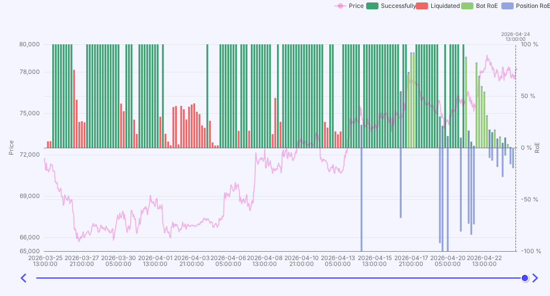
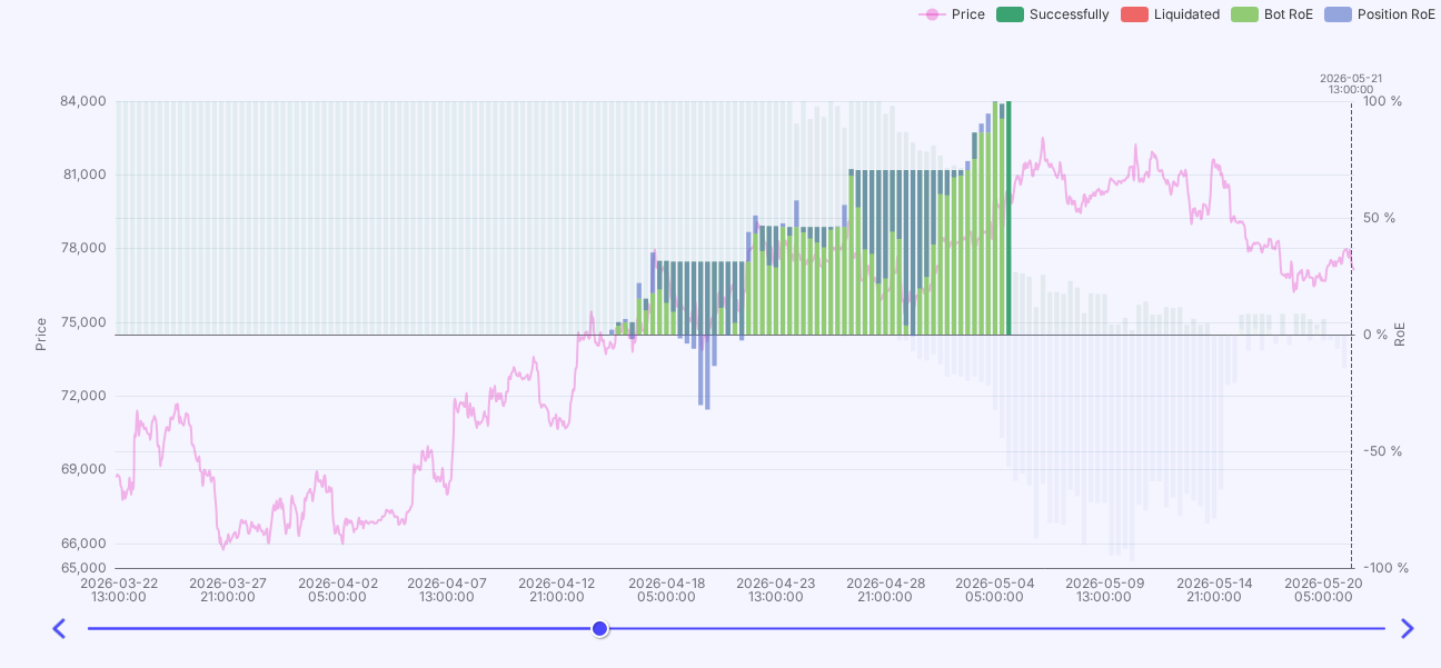
By default the chart shows the big picture. Each bar is one test run of the bot, and its height is the profit reached: the higher, the better. Color shows the outcome: dark-green – runs that doubled the deposit (100% and more), red – liquidations. The line over the bars is the asset price over the same period, so you can see what market the preset worked in.
The chart has a slider arrow you can move along the timeline (with the keyboard arrows). As you move it, you walk through the period and see the status of all bots at that moment.
Simple rule
Click a specific run (bar) and its detailed view opens. Here you can see how that very run unfolded: how the profit changed over time, how the bot averaged in on drawdowns, and how it ended. Handy for understanding the preset behavior in a specific situation, not just the final number.
Good to know
Any questions about this article? Ask or discuss them with real traders in our Community Chat.
If you have any questions, ask them in profitage_support_bot. Our support team operates 24/7 and is ready to assist you and to clear all your doubts and fears ❤️